Cachet is a brand under the umbrella of Kim’s Chocolate, one of Belgium’s biggest chocolate manufacturers and nr 1 chocolate exporter to more than 67 countries. Of course we felt honoured Kim’s Chocolate contacted DesignRepublic for a complete make over of the Cachet Standard Range
CACHET
Packaging Design
What we did
Categories
brand architecture / styling / art direction / execution
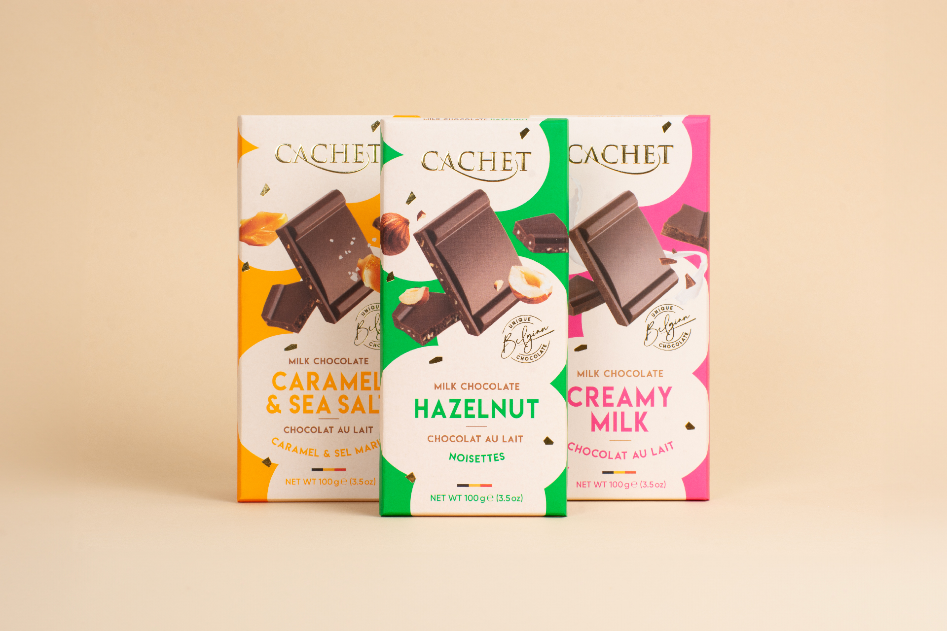
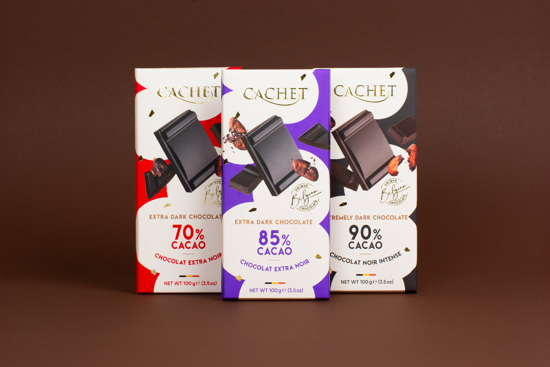
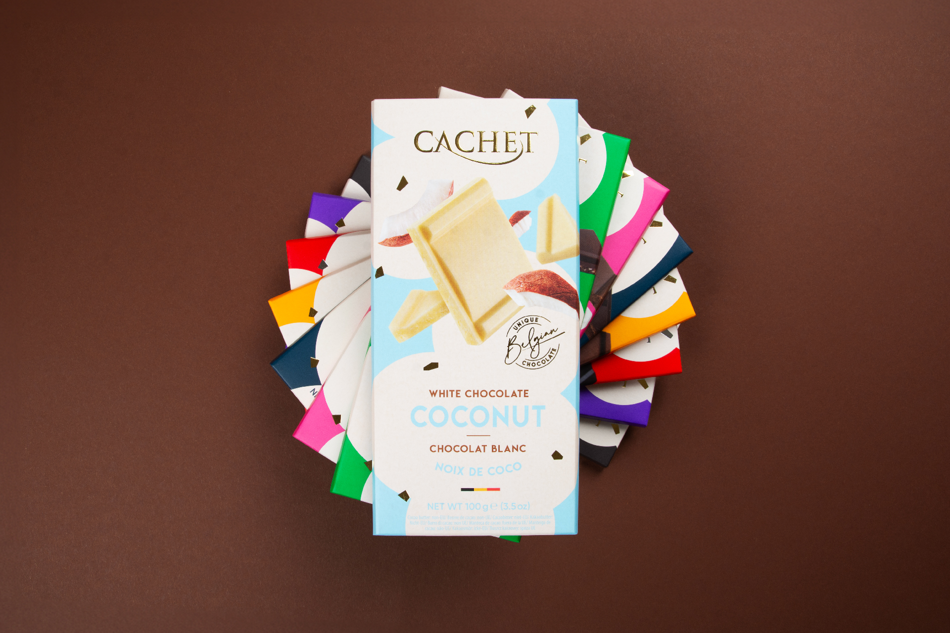
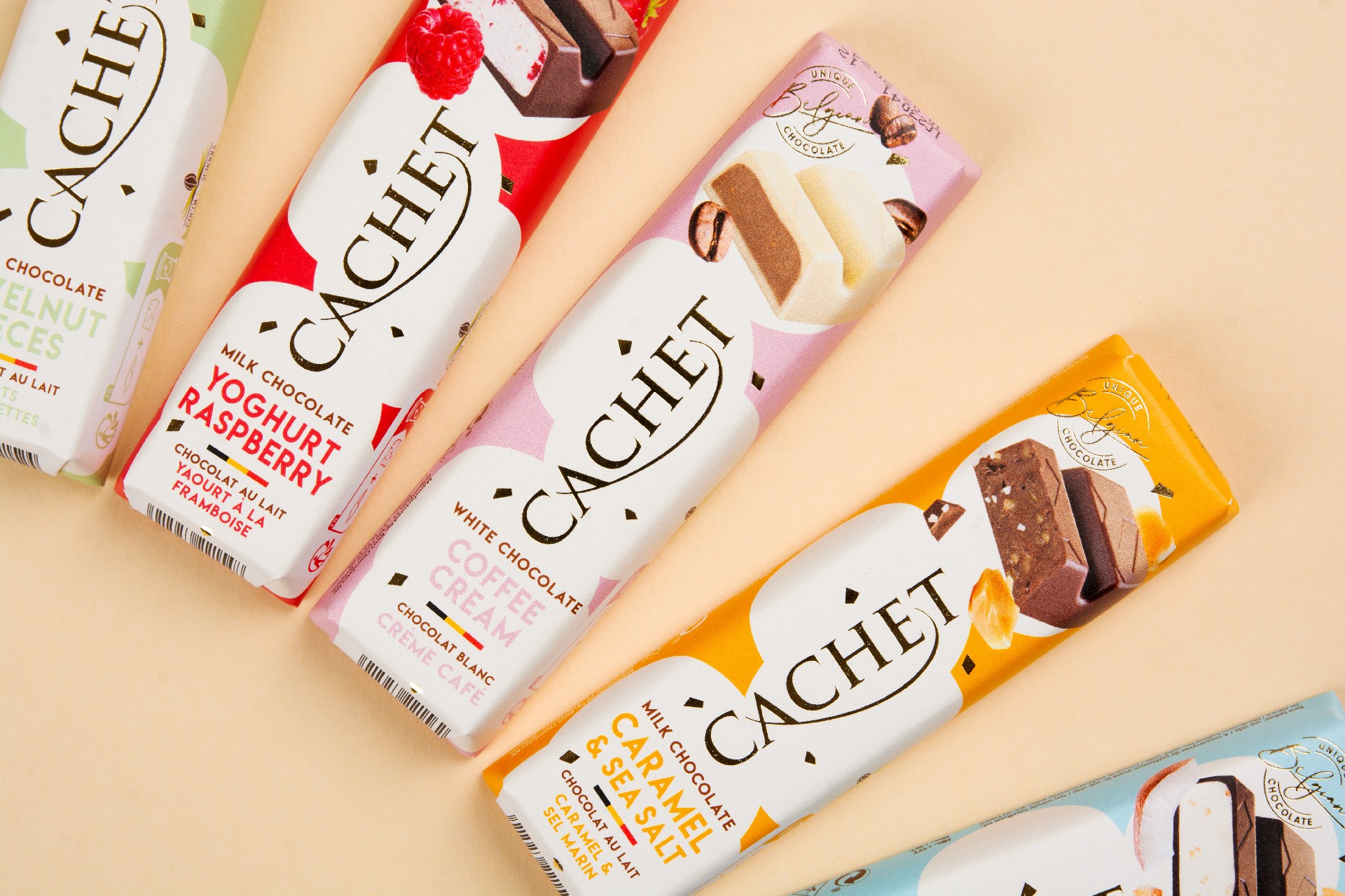
The briefing was straightforward: Kim’s Chocolate wanted to have a complete makeover of the existing Standard range. The look & feel needed to be classical, quite premium and modern, and directed to an audience of the big retailers in (eastern) Europe. The only element we could not touch was the name ‘Cachet’ and the logo.
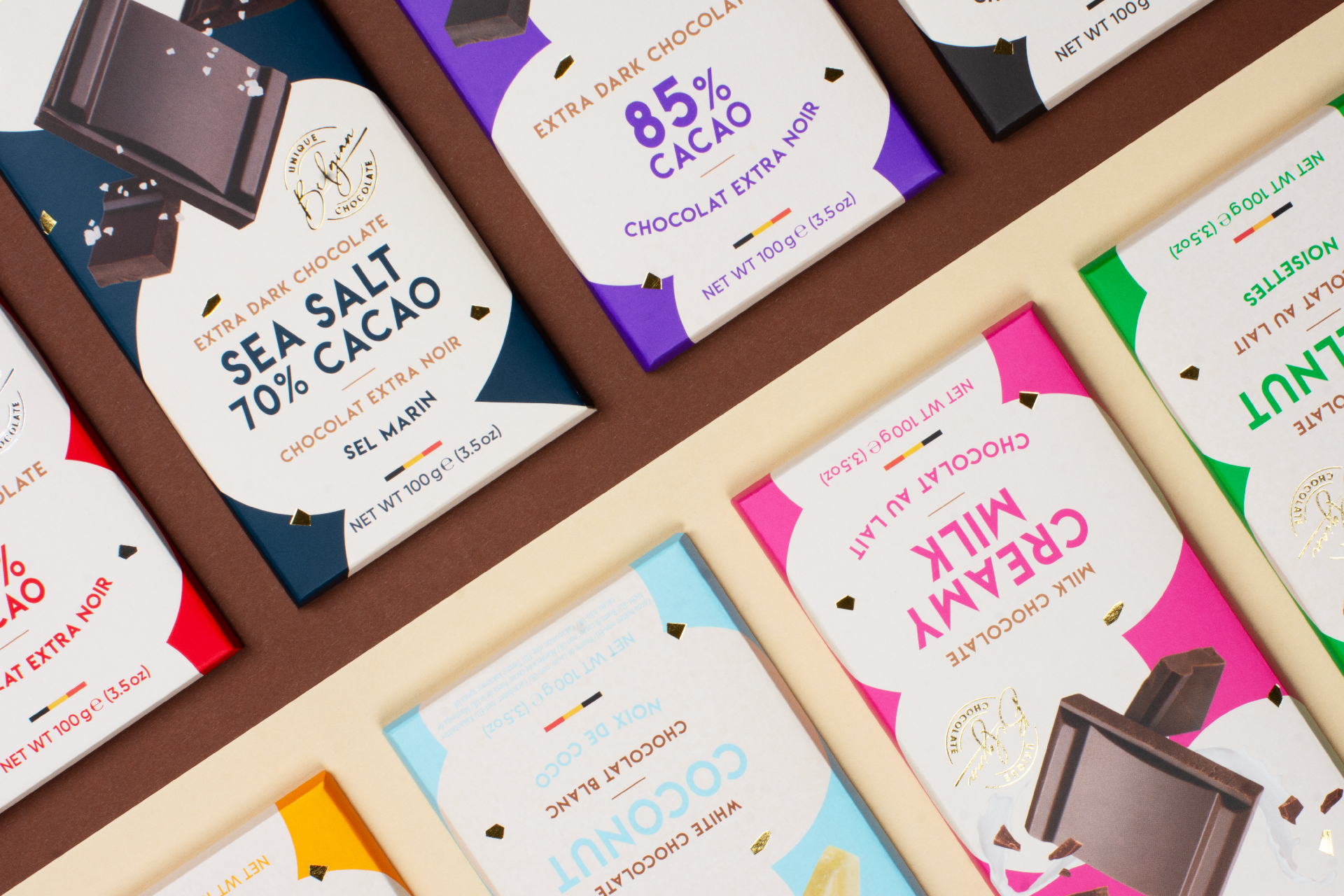
As this range consists of many varieties we choose to develop a recurring pattern that we used with many different colours. We wanted to have a dynamic design with the chocolate pieces and ingredients flying around. Next to that we added shiny gold/silver foil sparkles to add a premium element, together with the logo printed in gold. This sparkling, colourful, dynamic design creates a maximum shelf impact.
After the roll out of this design, Kim’s chocolate contacted us again for the development of another range: a prove that our work is a great (commercial) succes 🙂


