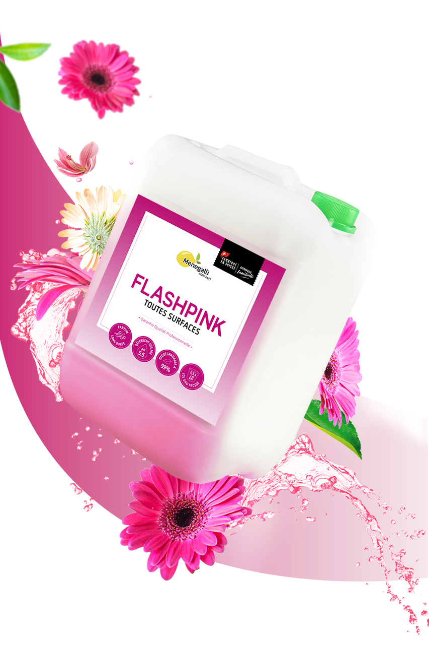
Keyvisual Menegalli

Menegalli
Branding & Packaging Design

Swiss cleaning products with Switzerland’s finest fragrances

Menegalli is a family business, founded in 1980 in Switzerland, by Senta Menegalli. Their business focusses on the production and distribution of maintenance products to the B2B market. In the early 2000’s, her sons, Orlando and Sandro onboarded the family business. End 2022 we had the honor to be approached by Orlando for the redesign of their packaging design.

Menegalli has been working for years with the long-established Swiss perfumer LUZI. Fragrance plays a vital role for those who clean… but also for those enjoying the fresh, clean spaces afterwards! More and more requests came in from individuals who were intrigued by the mesmerizing fragrances of Menegalli. Since 2020 their products are also available on the B2C market.

What we did

Categories

packaging design / branding / naming / graphic design / artworking

Mengalli branding Suisse
Menegalli Communication Claire

Our assignment

With this break-through on the B2C market, Menegalli decided it was time to improve their packaging design. The design had to be clearer, more readable and in line with the retail market. Also the product portfolio had to be expressed in a clearer way for the end-user in terms of: application (floor / window / specialized products) and ready-to-use products versus concentrates.

A big step in the process already was a switch from a single product label to a back and front label, allowing more space for branding.

We felt so inspired by Orlando’s amazing story, that it we decided to use the olfactory aspect as an entry point for our work.

Clair communication Menegalli
Menagalli swiss cleaning products

For each of the fragrances we carefully depicted an inspiring and intuitive color code. Heritage and origin are inherent key features of the Menegalli DNA. We designed a premium-looking black placeholder device to communicate these features and placed it visually almost linked to the brand logo. Local quality is being extra endorsed by an illustration of the Swiss flag.

To ensure clear product differentiation and each of the products’ assets and features, we created a range of special round shaped picto’s.

In terms of design architecture on a product level, the entire range consistently follows the same clear structure: concentrate, fragrance, application, quality assurance, feature and asset in picto-shape.